Blueberry: The Must-Have Shade of Spring 2025
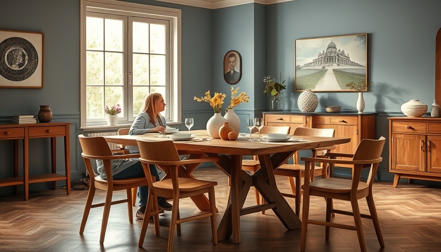
This spring, a warm and inviting shade known as Blueberry has taken centre stage in home design, emerging as a favourite among interior enthusiasts and designers alike. As this vibrant hue gains popularity, it presents itself not just as a colour choice for décor but as a lifestyle statement. However, to truly harness the beauty of Blueberry in your space, it’s essential to choose complementary colours wisely. Let's explore why Blueberry is the ‘it’ colour of the season and delve into the three colours you should avoid pairing with it.
Emerging Trends in Colour Pairings
In today’s fast-paced design landscape, colour trends evolve rapidly, thanks in part to social media influencers and design bloggers. Blueberry, reminiscent of serene skies and fresh beginnings, encapsulates the whimsical spirit of spring 2025. Its popularity can be traced back to its versatility; whether used in paint, fabrics, or décor, Blueberry evokes a calming ambiance. However, experienced designers caution against certain pairings that could clash with this lush blue.
Steer Clear of Bright Green
You might be surprised to learn that while green is often heralded as a neutral colour, it doesn’t mesh well with Blueberry. Experts like Lee Trethewey from Sustainable Furniture emphasize avoiding bright greens—specifically neon shades. This advice stems from the boldness of both colours; when combined, they can create an overwhelming visual onslaught. Instead, consider soft shades like sage or muted greens which harmonize beautifully and evoke the tranquil beauty of a blooming garden.
Why Bright Orange Doesn’t Work
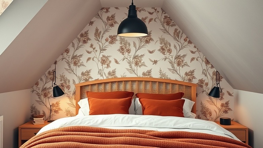
Although Blueberry and orange share the vibrant energy inherent in colour theory, their combination can produce troublesome interiors. Bright orange suits boisterous personalities, but interior design aims for harmony. Camilla Lesser, a Property Development Manager, notes that while blue and orange are complementary colours on the wheel, in practice, their pairing can feel jarring—especially when both colours are strikingly bright. A better option is to embrace pale or burnt oranges that invite a touch of warmth while preserving the essence of Blueberry without overwhelming it.
Red: A Colour to Avoid with Blueberry
The allure of primary colours, such as red and blue, has captured the hearts of many, yet using these bold shades together can backfire. Bright red paired with Blueberry can evoke feelings of childhood nostalgia, but not necessarily in a well-executed design way. Instead, aiming for softer reds can provide the necessary contrast while maintaining elegance. This approach offers an inviting gesture rather than a collision of two powerful forces.
The Art of Choosing the Right Pairings
Creating the perfect colour palette involves more than mere aesthetics; it's a science rooted in understanding how colours interact. Here are a few tips to enhance your Blueberry palette:
**Use Soft Pastels:** Pair Blueberry with soft pastels like blush pink or lavender to create a dreamy, serene atmosphere.
**Add Neutrals for Balance:** Incorporating soft beiges or greys can ground the vibrancy of Blueberry while offering a respite for the eye.
**Texture Matters:** Play with different textures—such as velvet cushions or wooden accents—to add depth and interest to your space.
Personalizing Your Blueberry Spaces
To achieve a harmonious design that reflects your personality, focus on creating focal points using Blueberry without overpowering the rest of your décor. Integrate subtle details and chic décor items to emphasize this shade while maintaining balance throughout your living space. Remember, a well-curated environment brings forth the beauty of your chosen palette.
Explore the World of Colours
So as you contemplate your next design project, take a moment to think about how Blueberry can infuse your environment with warmth and charm. By avoiding specific clashing colours and opting for softer shades, you can elevate your home décor while embracing the energy of spring. As the design landscape continues to evolve, staying informed and adaptable is key. Discover new inspirations and ideas every day; after all, the right colour can uplift any room.
Call to Action: Ready to dive into a world of colour? Explore our guide on the latest trends in home décor and find tips and inspiration for your next project!
 Add Row
  Add
Add 


Write A Comment